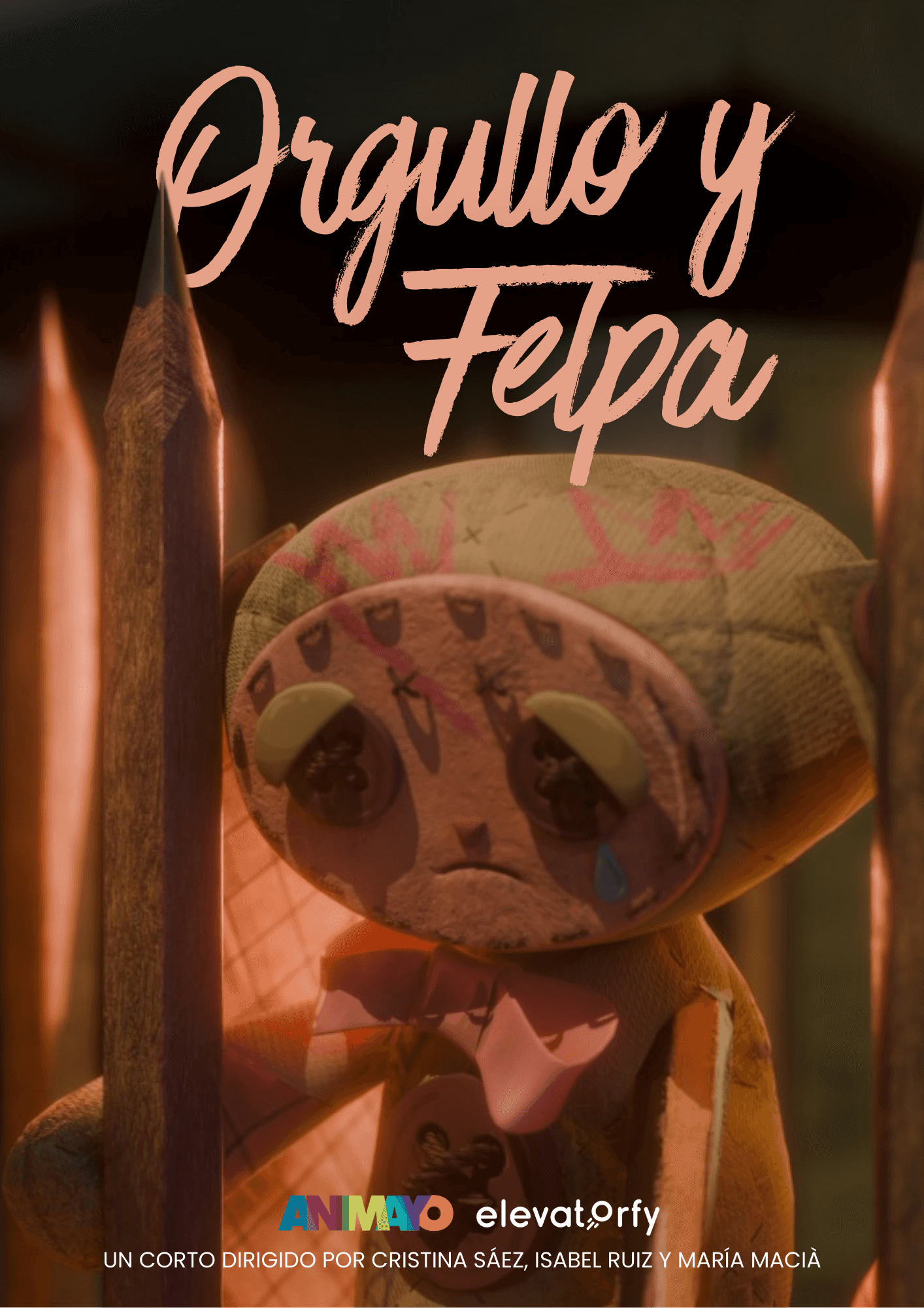
ORGULLO Y FELPA
PROMOTIONAL POSTERS,
2026
For Orgullo y Felpa, I led the graphic design direction, shaping the project’s visual identity and translating its concept into a bold and cohesive design system. The work focused on creating a visual language that communicates the spirit and character of the project.
You can learn more about this project here.




OTHER PROJECTS
OTHER PROJECTS
Branding · Graphic Design · Packaging
Branding · Graphic Design · Packaging
LA SOBREMESA, 2026
LA SOBREMESA, 2026
The Brief
After spending time in Puglia, I became interested in the similarities between Spanish and Puglian food culture. Both are strongly rooted in Mediterranean ingredients, informal dining and the social experience of gathering around a table. This became the starting point for exploring how Spanish cuisine could be presented through a contemporary visual identity within a Puglian context.
This project was born from that idea. I developed the branding and visual identity for La Sobremesa, a fictional Spanish tapas restaurant in Puglia. The concept combines Spanish culinary traditions with local Puglian influences, creating a distinctive identity that feels both authentic and contemporary.
The visual system was designed to translate the restaurant’s character across different brand touchpoints, from its logo and typography to colour, graphic elements and menu design. The project explores how branding and graphic design can communicate the atmosphere, personality and cultural dialogue behind a food concept.
At the centre of the identity is the Spanish tradition of sobremesa — the time spent around the table after a meal, sharing food, conversation and stories. This idea became the foundation for a warm, social and Mediterranean brand designed to bring the spirit of Spanish dining to Puglia.
The Process
I started by defining the concept and positioning of La Sobremesa, exploring the visual and cultural connections between Spanish and Puglian food. This research helped establish the brand’s personality, tone of voice and overall creative direction.
I then developed the visual identity, experimenting with typography, colour palettes, graphic elements and logo variations to create a system that felt contemporary while retaining a strong Mediterranean character. The identity was designed around the idea of sobremesa, translating its warm, social and informal nature into the visual language of the brand.
Once the core identity was established, I applied the system across different brand touchpoints, including menu design, layouts and supporting graphic materials. Particular attention was given to hierarchy, composition and consistency, ensuring that the identity worked cohesively across both functional and visual applications.
The final outcome is a flexible visual identity that combines Spanish and Puglian influences while giving La Sobremesa a distinctive and contemporary presence.
FINAL OUTCOME

ORGULLO Y FELPA
PROMOTIONAL POSTERS, 2026
ORGULLO Y FELPA
PROMOTIONAL POSTERS, 2026
For Orgullo y Felpa, I led the graphic design direction, shaping the project’s visual identity and translating its concept into a bold and cohesive design system. The work focused on creating a visual language that communicates the spirit and character of the project.
You can learn more about this project here.